If you’re a regular reader of this blog you may have noticed the distinct lack of charts.
I’ve written about my journey with R before, but not too much about what I do actually use R for. In short, I use it mainly for software engineering type work in order to automate other things in R, or to support the work of data scientists. There’s perhaps a bit more to it than that, but that’s the main thrust of it.
Since that work primarily involves R infrastructure and administration, creating my own charts isn’t something that comes up very much. As a result, I’m not great with ggplot2 and I struggle to use it every time I do actually need to. I just haven’t used it often enough to become really fluent.
I do love a good chart though and if you’ve worked in the tech sector long enough you’ll almost certainly have seen two famous ones from Gartner. The first is the “Hype Cycle”, which Gartner use to illustrate where various technologies are in terms of the hype vs the reality. The second is the “Magic Quadrant” which they use to show the position of individual players in a market in relation to the market as a whole.
I have some misgivings about the way these two charts are often used, but I’m not going to let that stand in the way of having some fun and trying to re-create them both with ggplot2!
The Hype Cycle chart
Once the core of a ggplot2 chart is in place I can get by, but getting to the first plot always seems to take far more effort than it should.
The good news for people like me is that there is a package called “Esquisse” from the team at dreamRs in France. This package provides a GUI driven plot builder which is great for producing all sorts of plots using ggplot2 (there’s a fantastic gif showing it in action on the dreamRs site).
The word “Esquisse” means “a rough sketch” and that’s exactly how I use it, though it’s plenty powerful enough to do all your ggplot2 work if you wanted. As well as the plots it also produces the code used to create them, which means you can tweak them afterwards as much as you like.
That’s exactly what I’ve done here. I created the hype_data dataset by hand, used Esquisse to create the base plot and then tweaked it - a lot. It took me a little while (and a lot of Googling!) to get it to this point, but I’m fairly happy with it for the time being.
library(ggplot2)

# set up our data
hype_data <- data.frame(
  position <- c(1,2,3,4,5,6,7,8,9,10,11,12,13,14,15,
                16,17,18,19,20,21,22,23,24,25),
  excitement <- c(1,3,5,7,9,8,6,4,3,2,2,2,2.5,3,3.5,4,4,4,4,4,4,4,4,4,4)
)

ggplot(data = hype_data) +
  aes(x = position, y = excitement) +
  # don't bother drawing the actual data - uncomment to show
  # geom_line(color = "#2171b5") +
  # set labels
  labs(title = "Gartner's hype cycle",
    x = "Time",
    y = "Expectations") +
  # draw the smoothed line
  stat_smooth(method = "loess", se = FALSE, span = 0.4, level = 1.5) +
  # set and then customise the theme
  theme_classic() +
  theme(
    axis.text.x = element_blank(),
    axis.text.y = element_blank(),
    axis.ticks = element_blank()) +
  # add the annotations
  annotate("text", x = 21.5, y = 4.25,
           label = "Plateau of productivity") +
  annotate("text", x = 13.5, y = 3.5, angle = 43,
           label = "Slope of\nenlightenment") +
  annotate("text", x = 11, y = 1.5,
           label = "Trough of\ndisillusionment") +
  annotate("text", x = 8.5, y = 7.5,
           label = "Peak of inflated\nexpectations") +
  # annotate("text", x = 1, y = 2, angle = 80,
  #          label = "New thing - Wheeeeee!") +
  annotate("text", x = 3, y = 1,
           label = "Innovation\ntrigger")
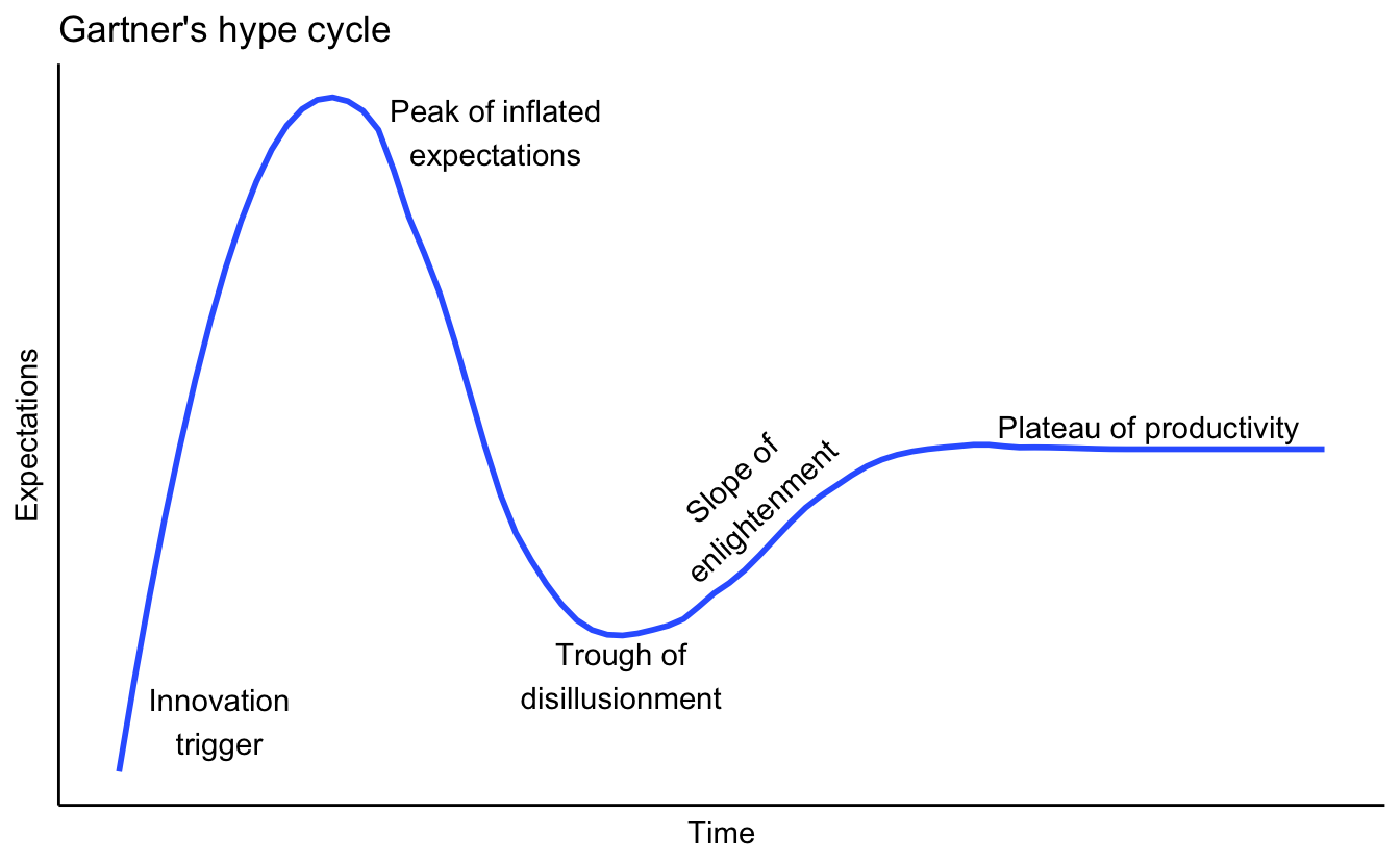
I’m still not 100% happy with the way the smoothed plot looks, it’s a bit “bumpy”, but it’ll do for now.
You could plot various technologies on it like Gartner do (“AI” anyone?) or just use it as a way to think about almost anything. Your new car, your job, relationships, whatever you like.
Magic Quadrant chart
Next we’ll be tackling the magic quadrant chart and hopefully making some improvements to the official one along the way.
The core of this chart came from somewhere on the internet, sadly I don’t recall where. The idea is that you have a square grid with a 0-10 range on each axis. You can then plot your data inside it as you see fit.
We’ll start with the core plot with no data for the time being.
library(ggplot2)

# custom empty theme to clear the plot area
empty_theme <- theme(
  plot.background = element_blank(),
  panel.grid.major = element_blank(),
  panel.grid.minor = element_blank(),
  panel.border = element_blank(),
  panel.background = element_blank(),
  axis.line = element_blank(),
  axis.ticks = element_blank(),
  axis.text.y = element_text(angle = 90)
)

plot <- ggplot(NULL, aes()) +
  # fix the scale so it's always a square
  coord_fixed() +
  # set the scale to one greater than 0-10 in each direction
  # this gives us some breating room and space to add some arrows
  scale_x_continuous(expand = c(0, 0), limits = c(-1, 11),
                     breaks = c(2,8), labels=c("2" = "", "8" = "")) +
  scale_y_continuous(expand = c(0, 0), limits = c(-1,11),
                     breaks = c(2,8), labels=c("2" = "", "8" = "")) +
  # apply the empty theme
  empty_theme +
  # labels
  labs(title = "Magic Quadrant",
       x = "Completeness of Vision",
       y = "Ability to Execute") +
  # create the quadrants
  geom_segment(aes(x = 10, y = 0, xend = 10, yend = 10)) +
  geom_segment(aes(x = 0, y = 0, xend = 0, yend = 10)) +
  geom_segment(aes(x = 0, y = 0, xend = 10, yend = 0)) +
  geom_segment(aes(x = 0, y = 5, xend = 10, yend = 5)) +
  geom_segment(aes(x = 5, y = 0, xend = 5, yend = 10)) +
  geom_segment(aes(x = 0, y = 10, xend = 10, yend = 10)) +
  # quadrant labels
  annotate("text", x = 2.5, y = 2.5, alpha = 0.35, label = "Niche Players") +
  annotate("text", x = 2.5, y = 7.5, alpha = 0.35, label = "Challengers") +
  annotate("text", x = 7.5, y = 2.5, alpha = 0.35, label = "Visionaries") +
  annotate("text", x = 7.5, y = 7.5, alpha = 0.35, label = "Leaders") +
  # arrows are cut in half which conveniently matches the gartner one
  annotate("segment", x = 0, xend = 10, y = -1, yend = -1,colour = "blue",
           size=2, alpha=1, arrow=arrow(type = "closed", angle = 15)) +
  annotate("segment", x = -1, xend = -1, y = 0, yend = 10, colour = "blue",
           size=2, alpha=1, arrow=arrow(type = "closed", angle = 15))

plot
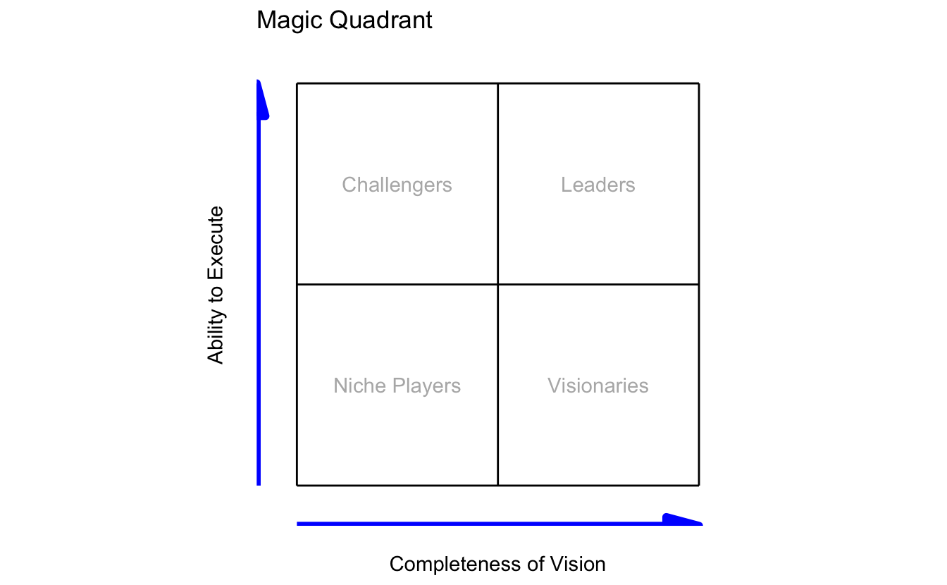
I’m pretty happy with this one. Having the arrows in blue and some opacity on the quadrant labels make it look a little nicer than the one in the version linked above. The opacity in the quadrant labels also means that when we do plot data on top it stands out better.
Since we’re not plotting real data on this chart but rather attempting to show relationships via relative positions I decided to add the contents of the plot using annotations.
plot <- plot +
  annotate("text", x = 7, y = 3, label = "GCP", color = "blue") +
  annotate("text", x = 8.5, y = 8.5, label = "AWS", color = "blue") +
  annotate("text", x = 4, y = 7, label = "Azure", color = "blue") +
  annotate("text", x = 4, y = 4, label = "Digital Ocean", color = "blue") +
  annotate("text", x = 3, y = 3, label = "Cloudflare", color = "blue")

plot
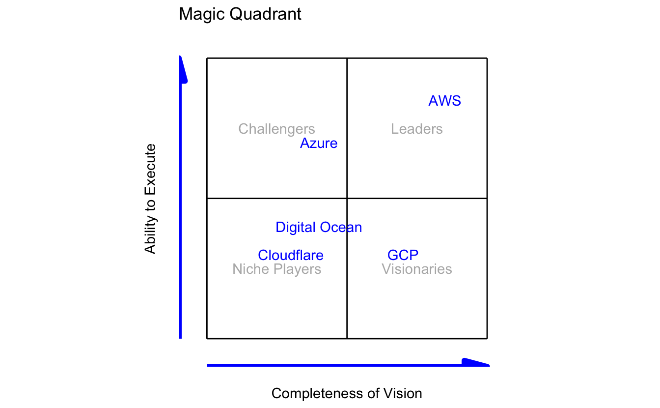
I’ve gone with a few cloud vendors here but you could use it for anything you like.
Plotting things by hand like this isn’t generally the best option though, so our final example uses a similar style of chart but with a “proper” data set.
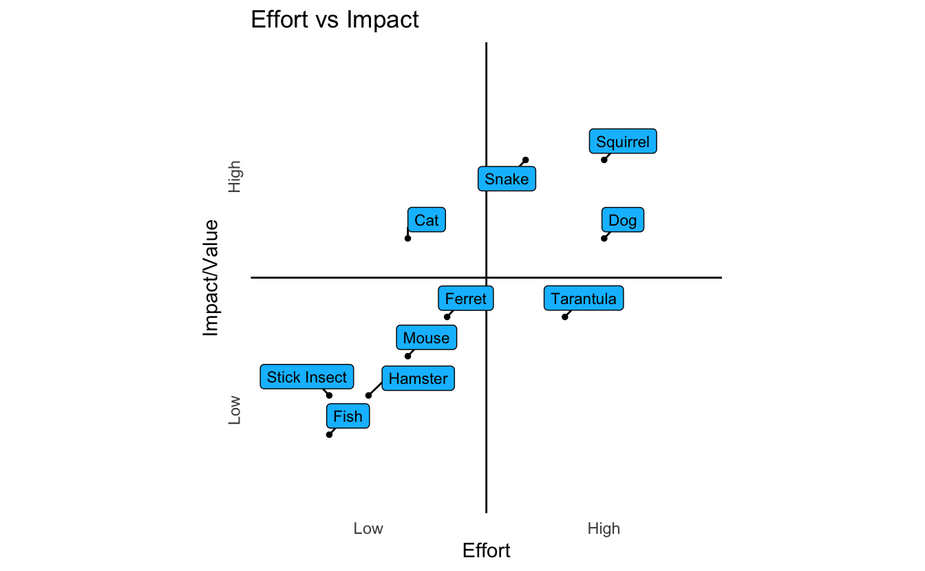
How I really use the magic quadrant…
I actually use a variation of the magic quadrant chart all the time. When I’m trying to decide what projects to focus on, or where I need to direct my efforts I use the “effort vs impact” chart below.
I score all the ideas or projects on a scale of 0-10 for the amount of effort they’ll require and again for the impact I think they’ll have. Once this is plotted it’s easier to see where you should direct your efforts. The “low hanging fruit” are those in the upper left quad that have high impact but require little effort. The original version of this was attached to a job ticketing system that was used to record ideas and their scores so the process was pretty much automated.
library(ggplot2)
library(ggrepel)

# create empty theme to clear the plot area
empty_theme <- theme(
  plot.background = element_blank(),
  panel.grid.major = element_blank(),
  panel.grid.minor = element_blank(),
  panel.border = element_blank(),
  panel.background = element_blank(),
  axis.line = element_blank(),
  axis.ticks = element_blank(),
  axis.text.y = element_text(angle = 90)
)

# create sample data
quad_data <- data.frame(
  title = c("Cat", "Dog", "Mouse", "Ferret", "Squirrel",
            "Fish", "Hamster", "Tarantula", "Snake", "Stick Insect"),
  value = c(6,6,3,4,8,1,2,4,8,2),
  effort = c(3,8,3,4,8,1,2,7,6,1)
)

# create plot
ggplot(quad_data, aes(x = effort, y = value, label = title)) +
  coord_fixed() +
  scale_x_continuous(expand = c(0, 0), limits = c(-1, 11), breaks = c(2,8),
                     labels=c("2" = "Low", "8" = "High")) +
  scale_y_continuous(expand = c(0, 0), limits = c(-1,11), breaks = c(2,8),
                     labels=c("2" = "Low", "8" = "High")) +
  empty_theme +
  labs(title = "Effort vs Impact",
       x = "Effort",
       y = "Impact/Value") +
  geom_vline(xintercept = 5) +
  geom_hline(yintercept = 5) +
  geom_point(colour = "black", size = 1) +
  geom_label_repel(size = 3,
                   fill = "deepskyblue",
                   colour = "black",
                   min.segment.length = unit(0, "lines"))
I’m not sure I’ll ever really master ggplot2 given how little I use it. Being able to create a simple plot very quickly with a tool like Esquisse and then iterating on it rapidly by tweaking themes and layers and so on is an extremely powerful way of working.
I’m sure there are loads of loads of improvements that I could make to these charts, but it’s been a lot of fun playing around with ggplot2 getting them to this point and it’s really helped me to understand it all a little better. Starting simple and then iterating your way to something much nicer is how all of my projects work and it’s great that I have a way to do the same with graphics.