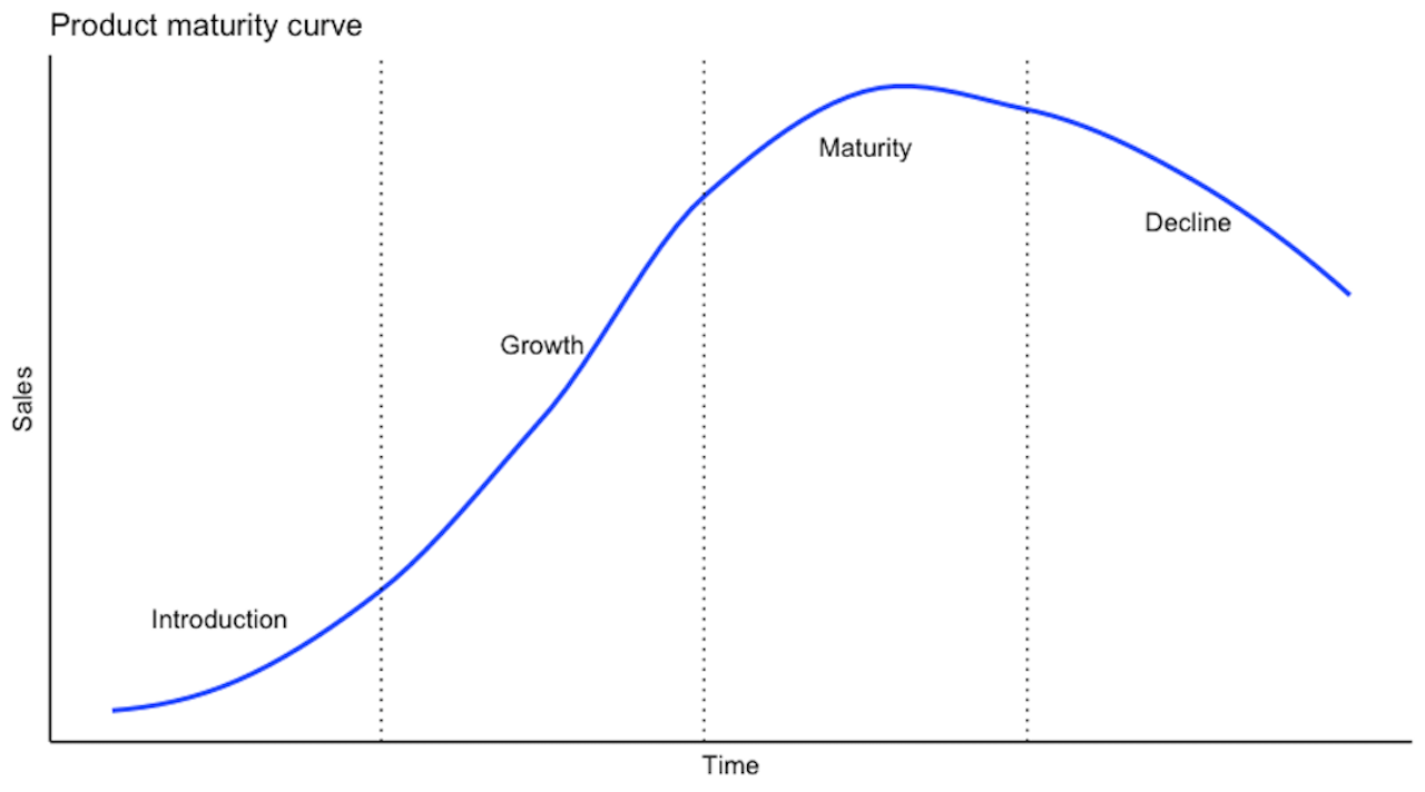
I’ve been thinking a lot lately about product maturity and how it applies to open-source projects. The product maturity curve shown above is often used in commercial product discussions to help people think about the product lifecycle.
To be honest, I have some pretty strong misgivings about it, but it can be helpful sometimes and I was thinking about recreating it in R (as is my way) and so here’s the code to create the plot above.
library(ggplot2)

# set up our data
df <- data.frame(
  time <- c(1,2,3,4,5,6,7,8,9,10,11,12,
            13,14,15,16,17,18,19,20,21,22,23,24),
  sales <- c(1,1,1,2,2,3,7,9,11,14,18,23,
             25,25,25,25,25,23,23,22,21,20,19,18)
)

ggplot(data = df) +
  aes(x = time, y = sales) +
  # uncomment to plot raw show
  # geom_line(color = "#2171b5") +
  # set labels
  labs(title = "Product maturity curve",
       x = "Time",
       y = "Sales") +
  # draw the smoothed line
  stat_smooth(method = "loess", se = FALSE, span = 0.75, level = 1) +
  # set and then customise the theme
  theme_classic() +
  theme(
    axis.text.x = element_blank(),
    axis.text.y = element_blank(),
    axis.ticks = element_blank()
  ) +
  # add the annotations
  annotate("text", x = 21, y = 20, label = "Decline") +
  annotate("text", x = 15, y = 23, label = "Maturity") +
  annotate("text", x = 9, y = 15, label = "Growth") +
  annotate("text", x = 3, y = 4, label = "Introduction") +
  geom_vline(xintercept = 6, linetype = "dotted") +
  geom_vline(xintercept = 12, linetype = "dotted") +
  geom_vline(xintercept = 18, linetype = "dotted")
Why would we want to do this? The great thing about recreating plots yourself with code is that it makes them pretty easy to customise to your own needs, allowing you to produce custom variations with minimal effort.
One of these days I’ll figure out a good way to properly smooth the curve, but it’ll do just fine for now.